Knock AI
AI-powered lead intelligence for B2B sales teams.
Platform
Web App
My Role
UI/UX Designer
Collaborated with
PM — Stav
Impact
31% in performance
Overview
Knock AI is a B2B sales engagement platform that enriches leads with intent signals and routes high-value buyers to the right rep in real time - cutting through the noise so sales teams only spend time on prospects who are ready to talk.
I joined as the sole product designer, building the platform from scratch over the course of a year - no design team, no design system, and only two early customers to learn from. Every decision was grounded in competitive analysis, direct customer feedback, and weekly ship cycles.
Who we're designing for
Our users fell into two distinct groups — and they needed very different things from the same product:
Experienced SDRs
Know exactly which routing rule to use. Just want to create the link and go. Extra steps slow them down.
Junior SDRs
Unsure which routing rule fits. Don't fully understand what happens after creating a link. Need guidance without feeling lost.
The Challenge
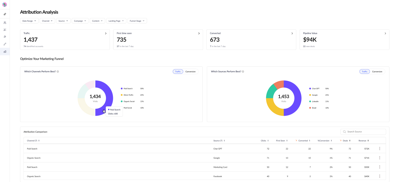
Meeting links are the main entry point for leads, routing conversations to reps — but backend data showed many weren't being used at all. Customers reported low conversions and responded by creating more links instead of improving existing ones. The result was a high volume of generic, underperforming links instead of a few optimized ones.
The original post-creation screen
Finding the root cause
Before jumping to solutions, I needed to understand where the breakdown was actually happening. Customer feedback pointed to the problem, but not the cause. I evaluated several testing methods:
Moderated usability testing
Primary methodWe had access to real reps, allowing us to observe the exact moment they stalled.
Unmoderated remote testing
ConsideredTools like Maze would scale better, but generic panels don’t include B2B sales reps.
Focus groups
Ruled outGroup dynamics risk the loudest voice shaping the narrative.
How we conducted the sessions
We ran moderated usability sessions with 6 SDRs - a mix of senior and junior reps from our two customers. Each session was designed around core UX research principles:
Think-aloud protocol
Participants narrated their thinking as they worked
Task-based scenarios
Tasks were framed as goals, not instructions
Neutral probing
No leading questions. “What was going through your mind?”
Mitigating observer effect
We framed each session as “testing the product, not you”
What we discovered
Junior SDRs often stalled after save. Since setup was instant and default routing was auto-assigned, many were unsure if they had missed a step.
Reps who activated links had no visibility into performance. Limited booking requests left them unsure whether their setup was working correctly.
The feature existed, but it wasn't delivering value. Iterating on the post-creation flow became the top priority.
End State Iteration
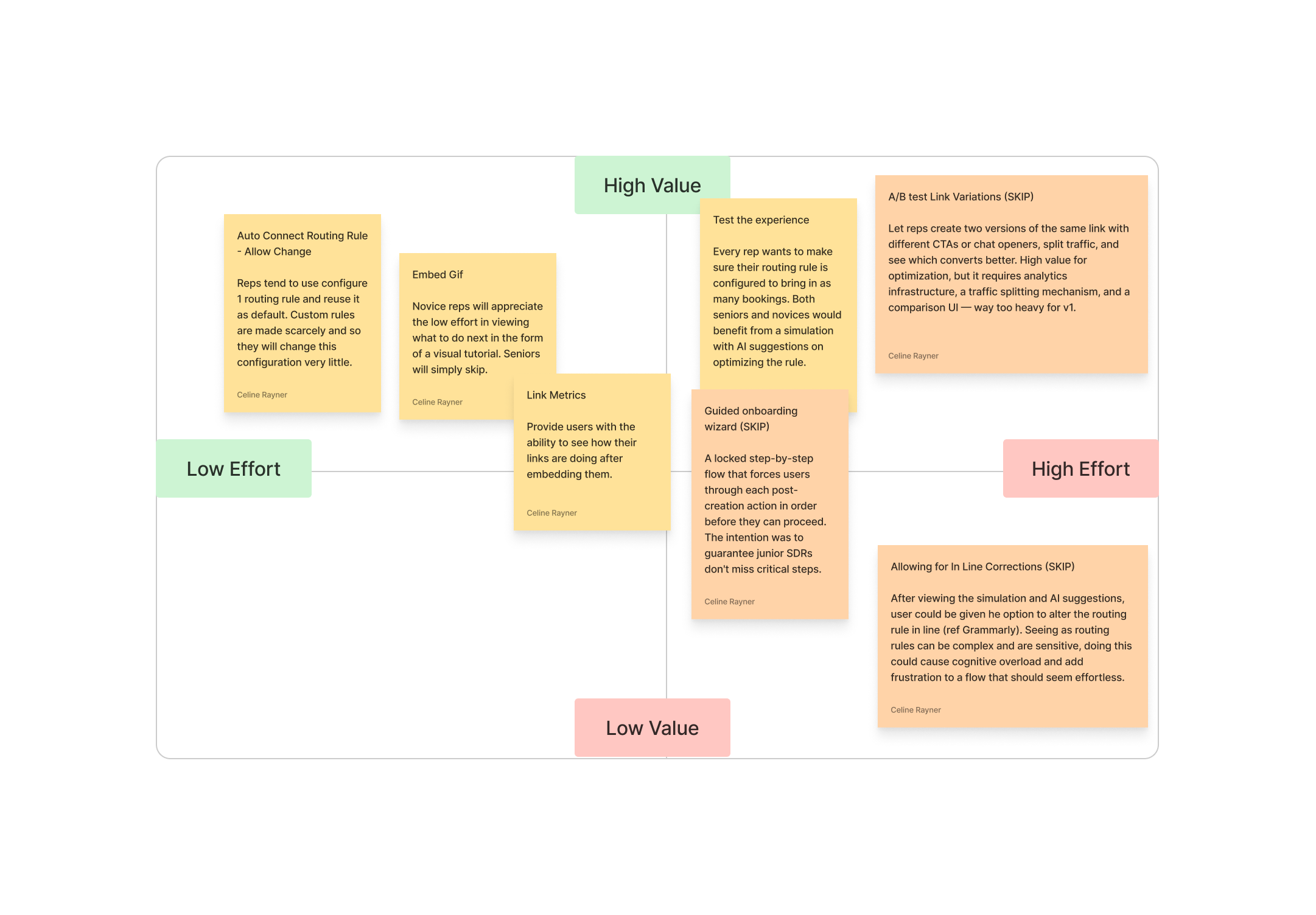
Three critical decision points shaped the redesigned post-creation experience:
Decision 01
Decision Matrix
I mapped post-creation features on a value vs. effort matrix to prioritize within our time constraints. Four high-value features made the redesign; the rest were deferred.
Decision 02
Design principles
Auditing post-creation flows in Calendly, HubSpot, Drift, and Intercom surfaced the same gaps over and over - dead-ends, buried routing, no path back to performance. Three principles emerged to guide the redesign.
Stay in context
After a user creates something, keep them on the same page - the work continues here.
Show, don't hide
Surface the most valuable controls - routing, simulator, AI - instead of burying them in menus.
Close the loop
The work doesn't end at “saved.” Give users a path back to performance data.
Decision 03
New design
The most prominent element in the old design provided zero value - the redesign rethinks the entire hierarchy. So I put the design into Builder.io, iterated, and shipped it.
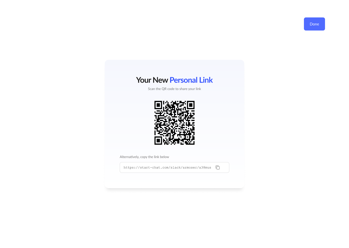
Link + deployment guide center stage.
Optimization flow given priority on the right.
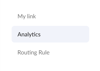
Routing rules made transparent.
Analytics tip closes the loop.
Before
After
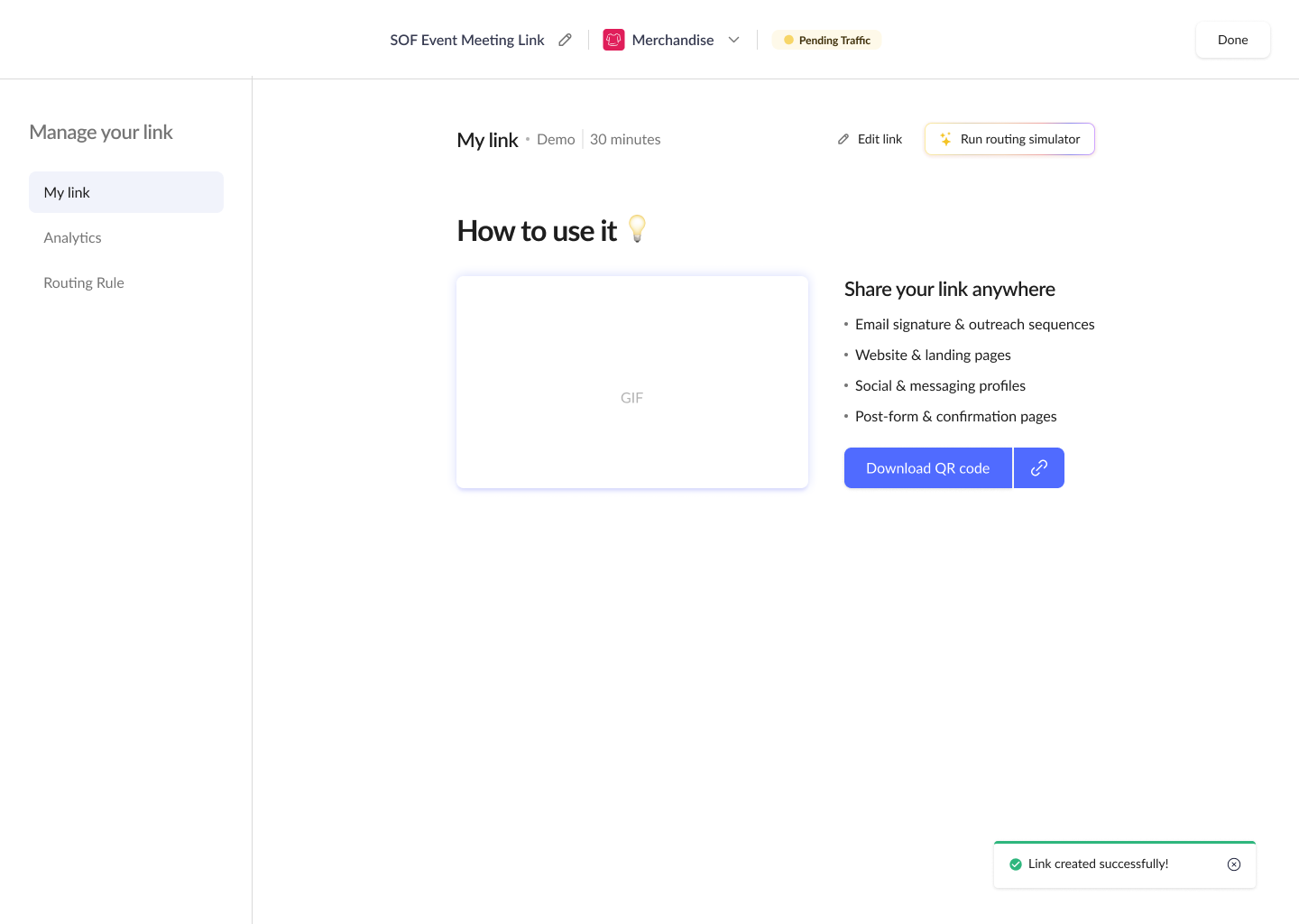
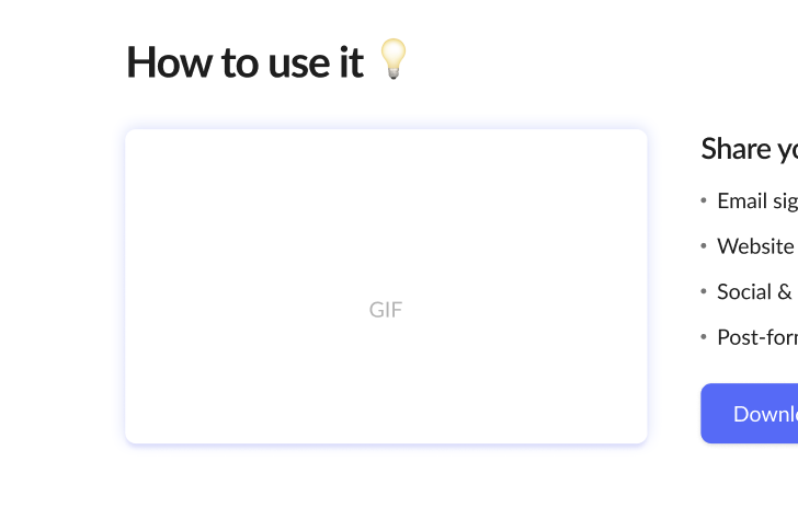
Deployment guide
Embed script + gif anchor the left panel.
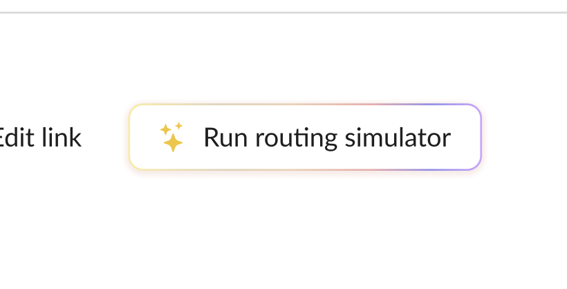
Simulator surfaced
Knock's differentiator gets primary placement.
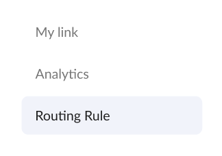
Routing transparency
Assigned rule visible and editable inline.
Analytics tip
Tells users where to see link performance.
The Outcome and Impact
57%
Increase in link usage
vs. previous flow
3×
More simulator runs
36% test new links
2.3×
Analytics return rate
Users viewing link performance within a week
More from Knock AI
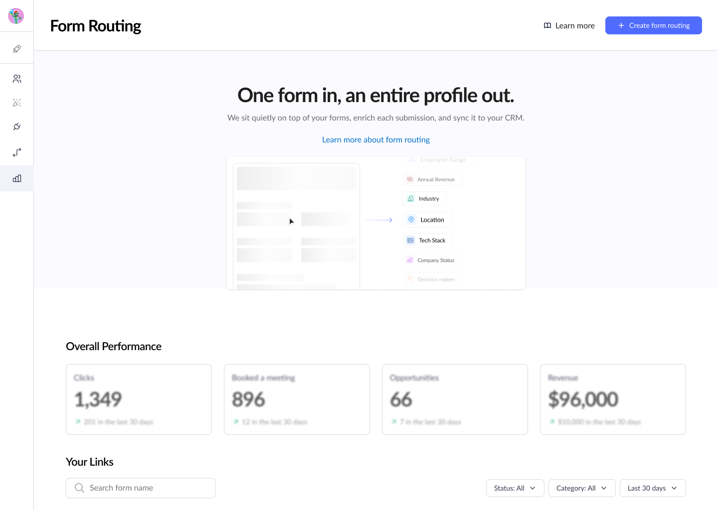
Form Routing
Most teams still rely on forms. We automate the flow, enrich submissions and qualify leads in real time so no opportunity slips through.
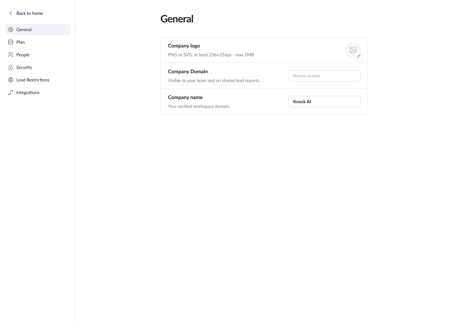
Settings
A workspace configuration page for managers to handle team setup, integrations, permissions, and billing.