ICP Report
Marketing’s impact, at leadership speed.
Platform
Web · Responsive
My Role
UX/UI Designer
Collaborated with
PM — Gal
Impact
+32% Contract renewal
Overview
Knock AI helps B2B sales teams enrich leads with intent signals and route high-value buyers to the right rep in real time. This project explores an executive summary that turns Knock’s data into a presentation-ready narrative, helping marketers communicate campaign performance and pipeline impact to leadership.
Full experience — start to finish
What marketing needed
Marketing leaders were constantly asked, “What’s our ICP?” — but lacked a clear, evidence-backed answer. They needed a report that was insightful, trustworthy, and easy to share across the organization.
TL;DR
I transformed raw segmentation data into a guided story, using transparent evidence, familiar customer examples, and progressive disclosure to help marketing teams discover new growth opportunities with confidence.
Who’s reading, and why
Before designing the report, I first asked who would actually read it, what they needed to walk away with, and what job each insight needed to do. This helped me define three core personas and the outcome each was trying to achieve, ensuring every chart and statistic earned its place.
Marketing Leader
Goal
Understand who to target next with confidence.
Job-to-be-done
When I inherit a customer base, I want to understand who our highest-value customers really are and where the biggest untapped opportunities exist, so I can confidently focus my team’s efforts with evidence.
RevOps Lead
Goal
Provide a defensible answer to “Who’s our ICP?”
Job-to-be-done
When I’m asked to define our ICP, I want one clear, data-backed answer that everyone can align around, so I stop being the bottleneck in every targeting conversation.
Knock
Business goal
Demonstrate that Knock transforms customer data into actionable growth opportunities, reinforcing its role as a trusted source of strategic insight — not just another analytics tool.
Before finalizing the layout, I wrote a JTBD for every stat that made it into the report.
Deal amount
Job: Show this segment brought in real money — a number marketers can repeat upward.
Average deal
Job: Show it’s a steady source of success, not just a fluke — something reliable.
Percentage of total revenue
Job: Put things into perspective — a holistic way to show the impact.
Number of companies
Job: Surfaces the recognizable names that anchor credibility — not a wall of every logo.
How I made the calls
Three decisions shaped the final report — each grounded in a persona’s job and a stat’s purpose.
Decision 01
Clarity over density
Numbers only work if the reader can find them. I kept each section calm — one headline metric leading, tight supporting copy, room to breathe — so hierarchy does the work, not the reader.
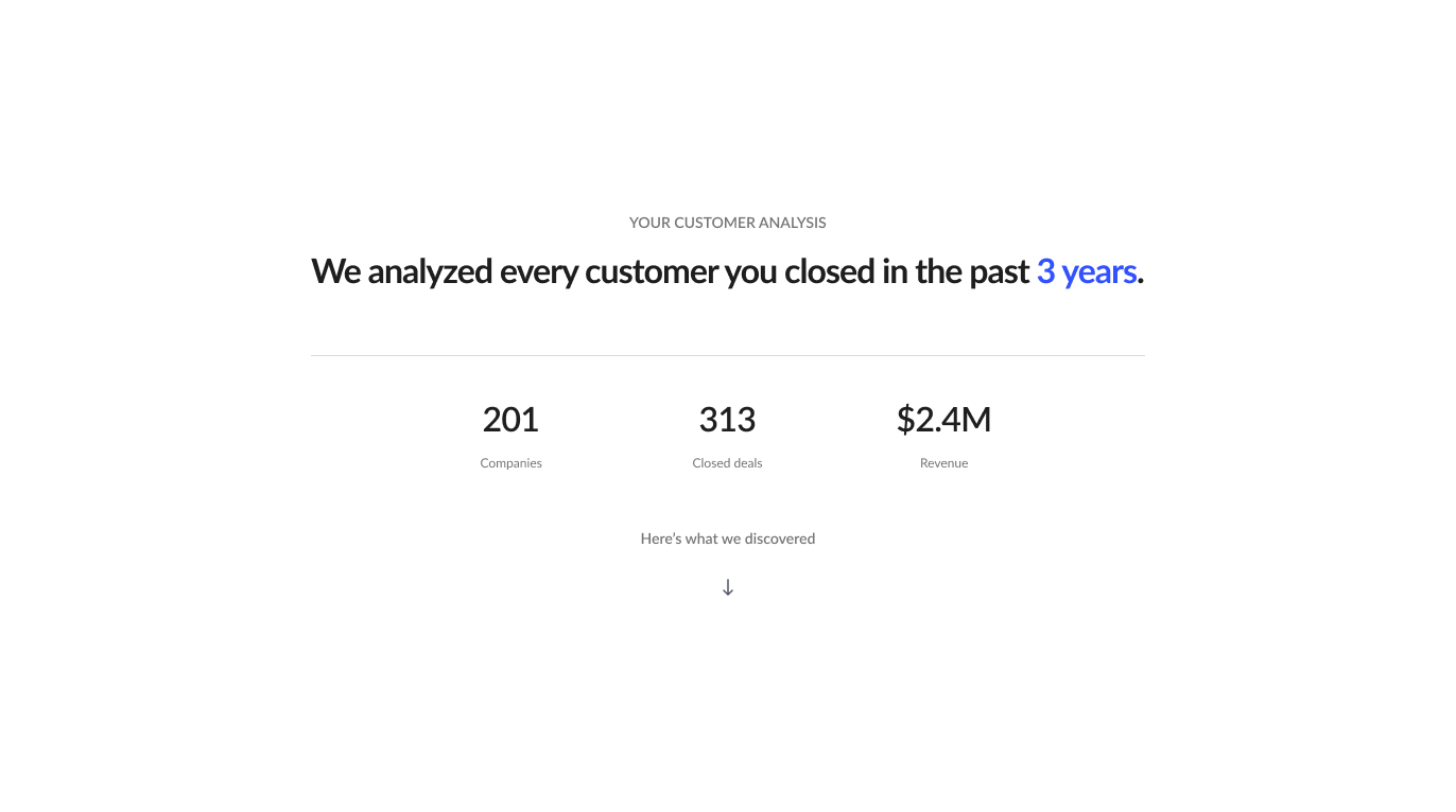
Decision 02
Tell a story, not a dashboard
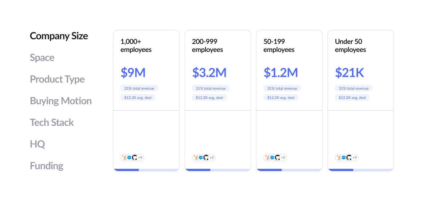
Guide users through a narrative. Rather than presenting isolated charts, each section builds on the last, leading users toward one memorable takeaway: their best customers share identifiable patterns — and those patterns reveal untapped revenue opportunities.
The story arc
- 01
Biggest opportunity
- 02
Other segments were found
- 03
One is taking off while another is slumping
- 04
More opportunities by slicing the data differently
- 05
Key takeaways
Decision 03
Focus on opportunity, not mistakes
Frame insights positively. Every recommendation emphasizes where future growth can come from, rather than implying previous targeting decisions were wrong. The message is “Your next dollar works harder here,” not “You’ve been doing it wrong.”
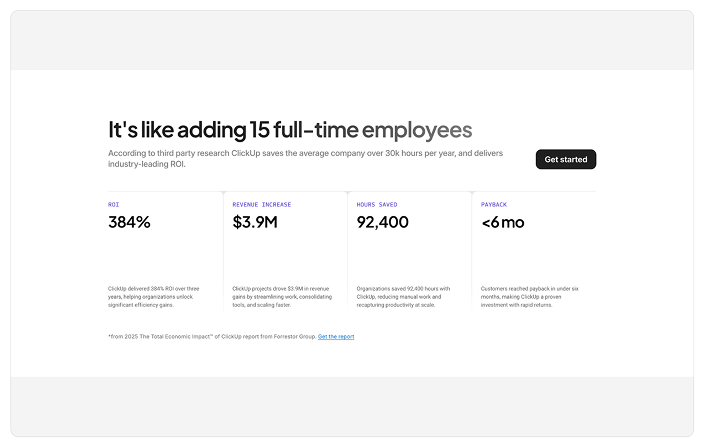
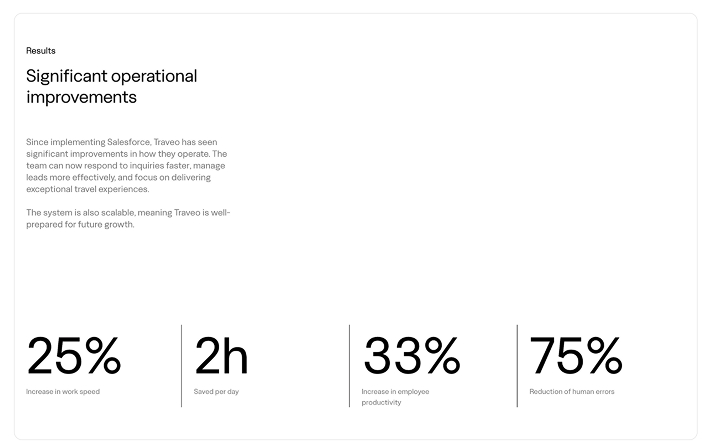
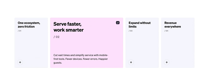
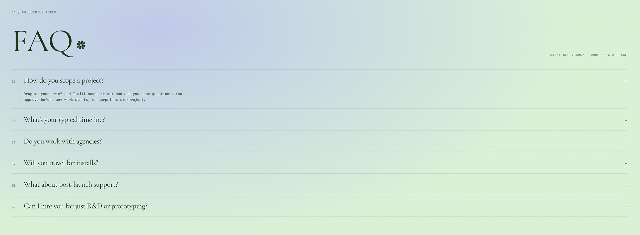
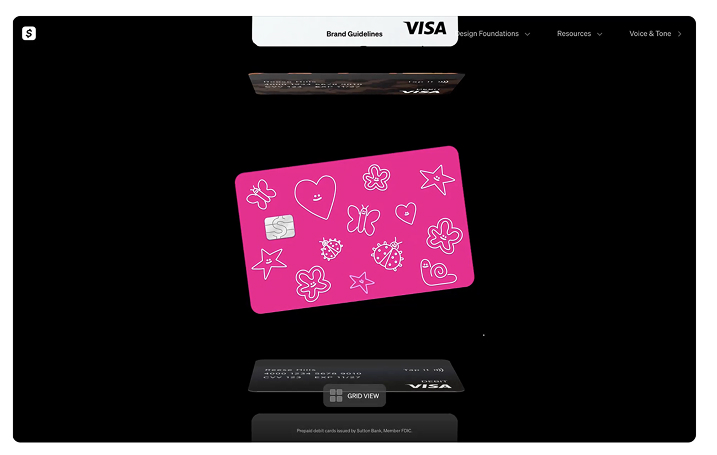
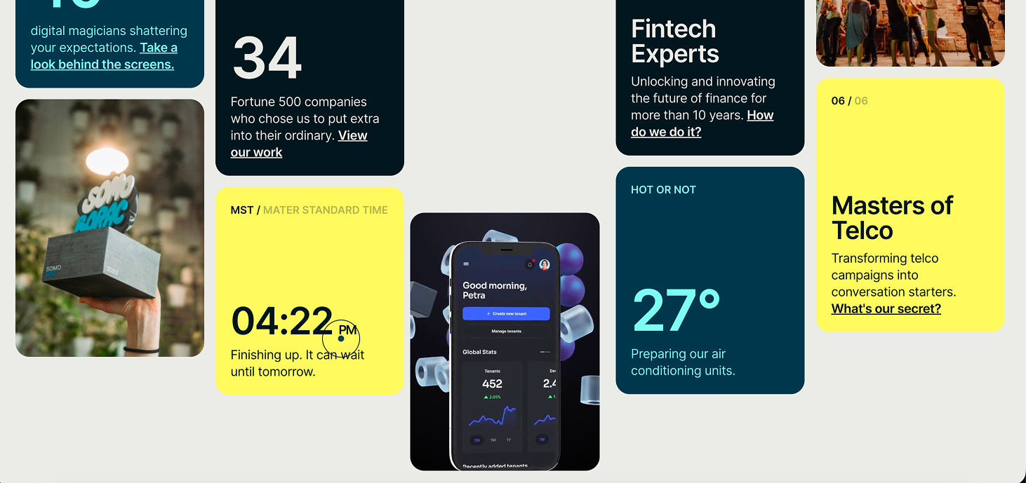
I looked at references through three lenses — Pattern (how the component behaves), Treatment (how it’s dressed), and Tone (how it should feel).
Pattern
How the component works — states, flows, edge cases.
Treatment
How the same component gets dressed differently.
Tone
Feel, not reuse — emotion I want the design to hold.
The shipped design
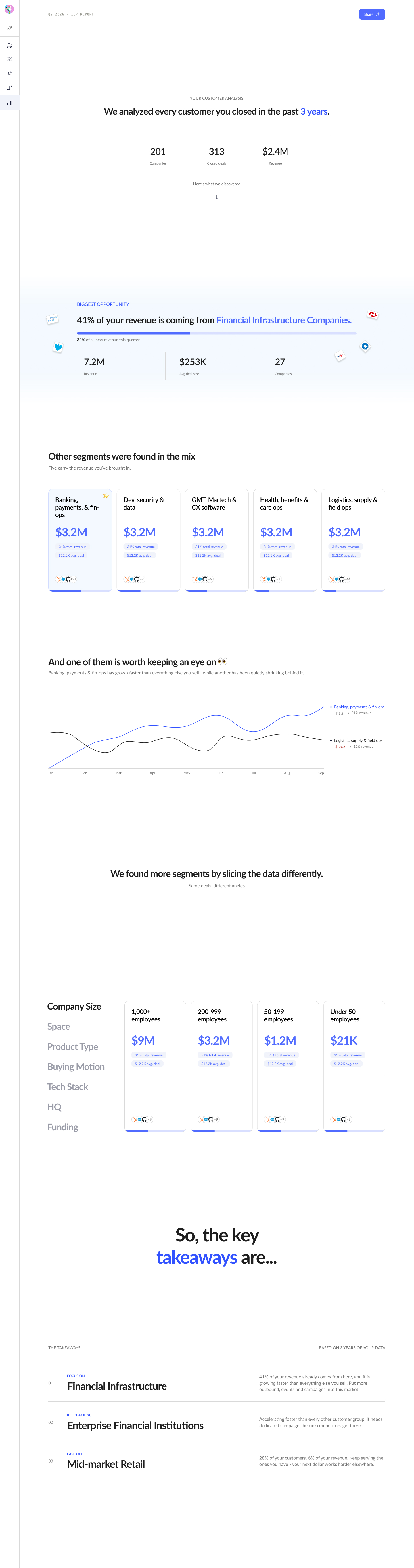
The shipped experience — a single scroll that walks leaders from biggest opportunity to key takeaways.
How it came together
Every phase fed the next — research shaped the skeleton, references shaped the look, and Claude Code let me spin up and refine multiple concepts in real time rather than picking one direction too early.
- 01
Research
Sat with the numbers. Wrote a JTBD for every persona and every stat before touching a layout.
- 02
UX skeleton
Wireframed the story flow — biggest opportunity first, disperse into segments, close with takeaways.
- 03
UI inspiration
Collected references across Pattern, Treatment, and Tone. Built the mood board to align on feel before touching Figma.
- 04
Iterated with Claude Code
Used Claude Code to spin up multiple working concepts fast — refined each against the JTBD instead of committing to one direction too early.
- 05
Researched React libraries
Vetted charting and animation libraries the dev team could actually adopt (Recharts, GSAP, Framer Motion). Picked ones that matched the visual direction.
- 06
Handoff to dev
Delivered a working prototype in Builder.io alongside component notes — cut down on developer round-trips.
What happened after ship
The report is entering rollout. Early stakeholder walkthroughs surfaced positive feedback and a request to make the exec summary a recurring artifact in leadership syncs.
What I’d still love to do: validate the story arc with real users — even a small round of usability testing would tell me whether marketing leaders track the narrative or skim it.