Airbnb Services
Auditing and reimagining how Airbnb's newest feature fits into the platform experience.
Type
Concept Project
Platform
Desktop App
My Role
UX Audit & Redesign
What caught my eye
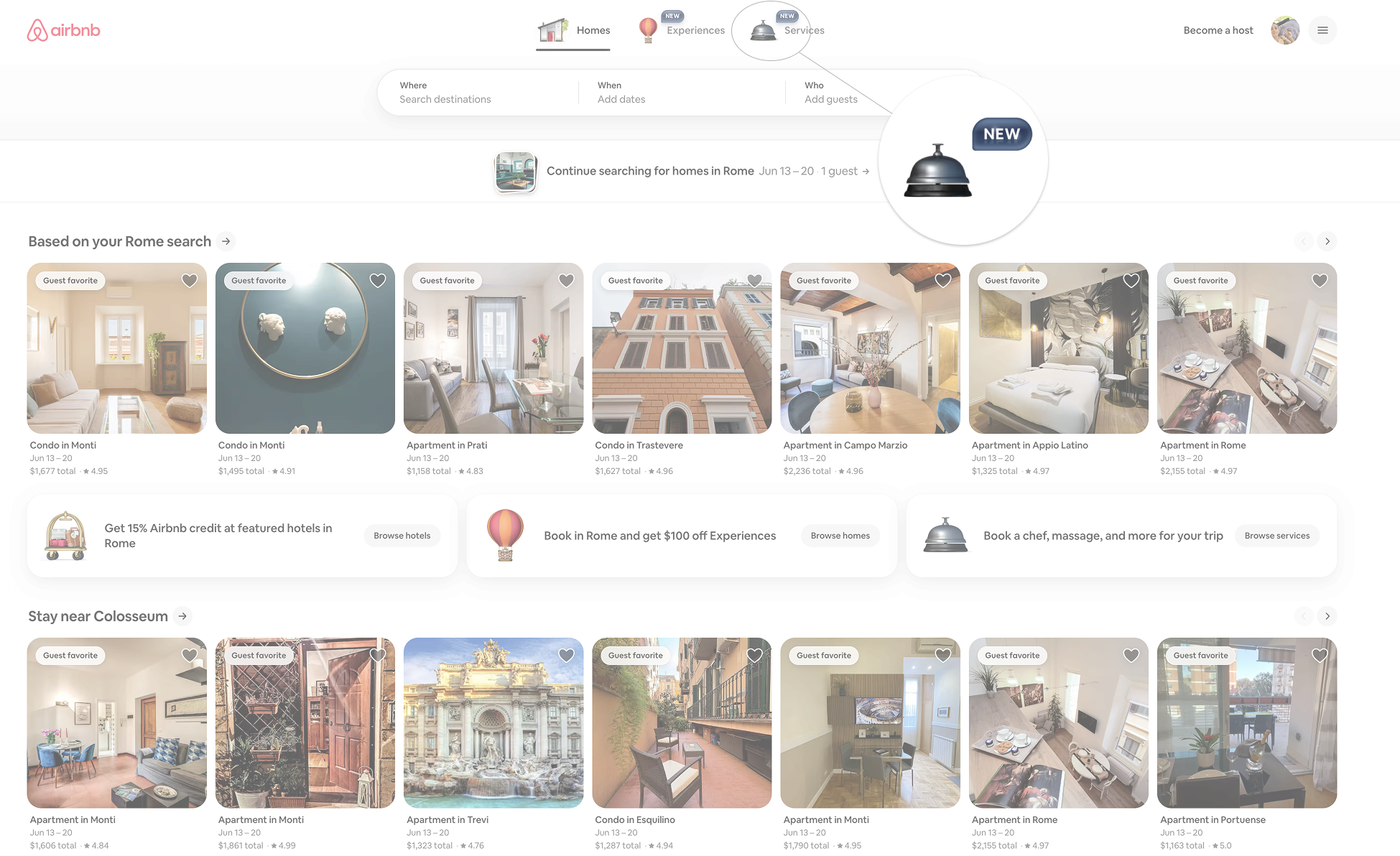
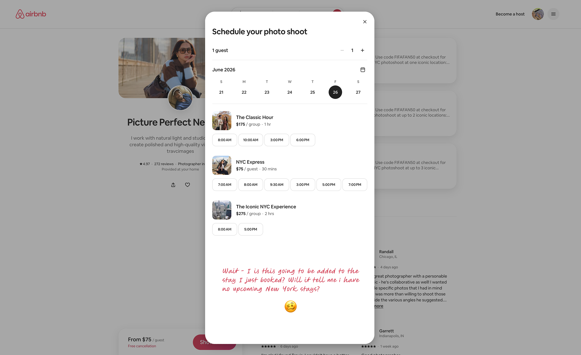
Airbnb released a new feature - Services. A dedicated tab for booking local experiences like photography. As a long-time Airbnb user, something felt off. It seemed detached from the familiar Airbnb flow.
A few questions came to mind: Would established users readily discover this new tab? How does “Services” fit in with the existing user flow? As Airbnb adds more tabs, are these meant to be used together or function as standalone products?
Mapping the friction
I mapped out the full user journey across four stages - discovery, filtering, evaluation, and booking - to see where the experience breaks down.
TL;DR
I observed users across 4 booking stages, clustered findings into 3 friction themes, and formed a hypothesis to guide the redesign.
Research approach
I conducted deep interviews with 2 friends (Eli and Belen) who frequently use Airbnb - sitting alongside them through the Services flow and observed all points of friction.
To go broader, I ran AI-powered synthetic research at scale across different traveler personas - stress-testing edge cases and behavioral patterns a small sample couldn't surface alone.
Discovery
How do users find out Services exists? Is the tab visible enough? What happens if they never tap it?
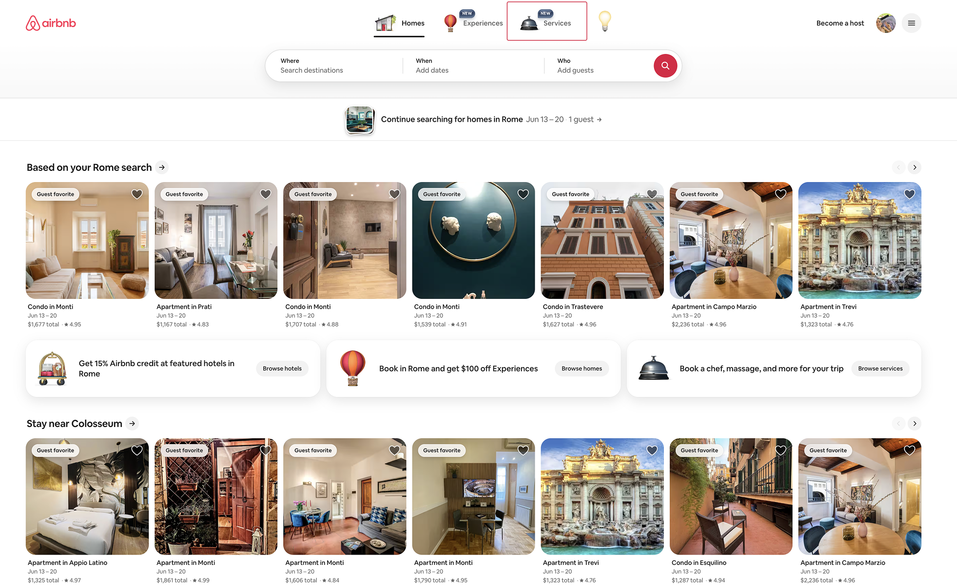
Filtering
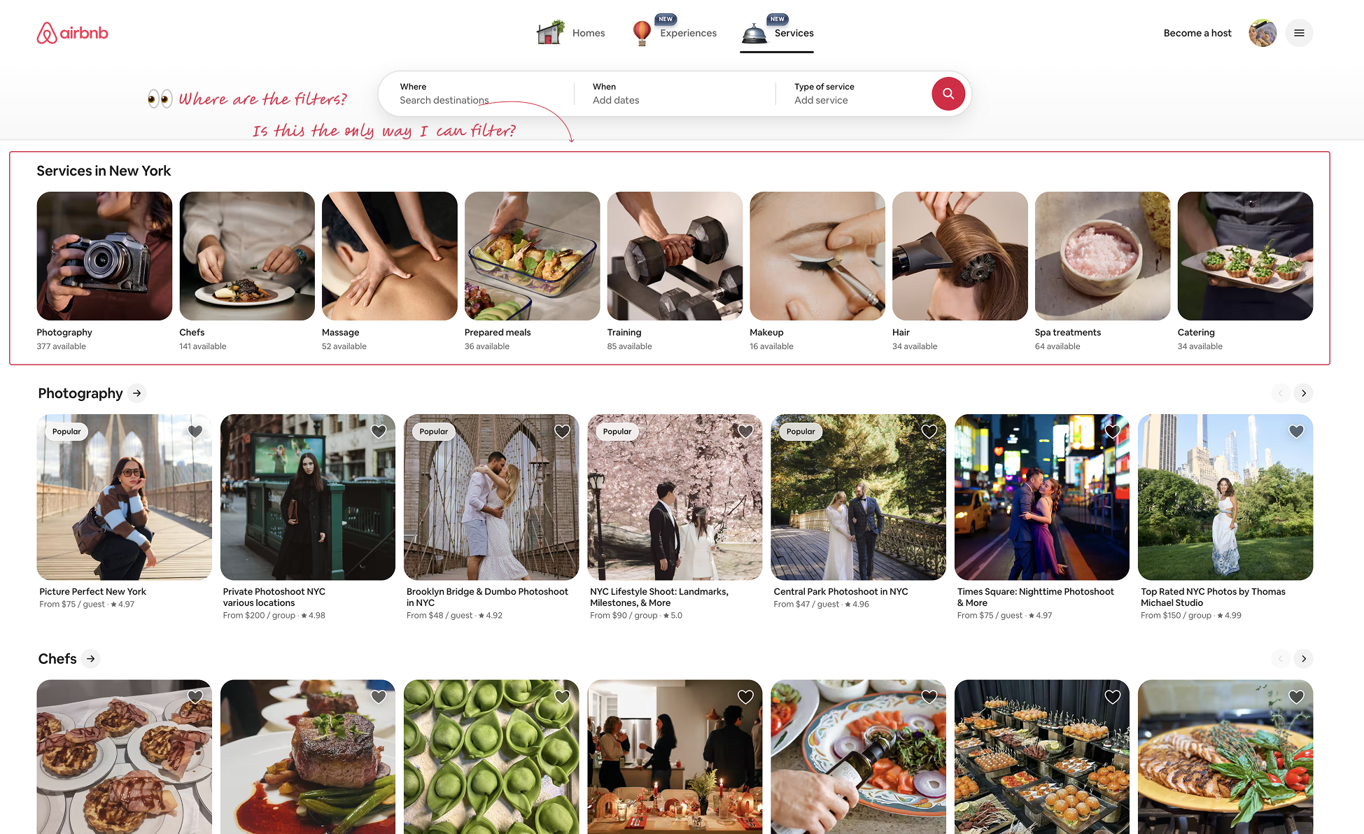
Once inside, can users narrow down what they need? Are the categories clear? Does the filtering feel native to Airbnb?
Evaluation
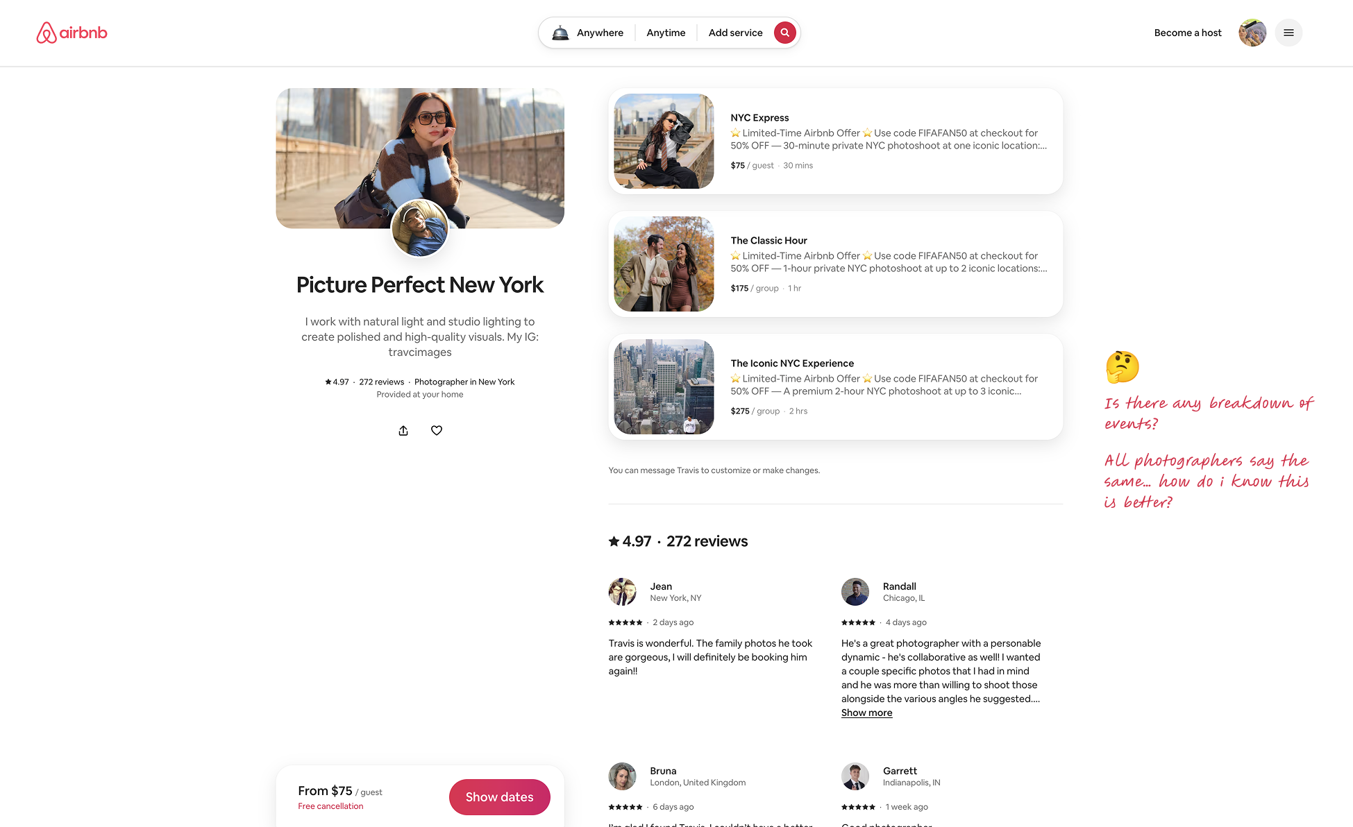
How do users compare and evaluate services? Is there enough information to make a confident booking decision?
Booking
Does the booking flow feel familiar? Does it connect back to an existing stay, or is it completely isolated?
I took notes on all possible areas in which users struggled to understand something or expressed weariness to continue, and clustered them into themes.
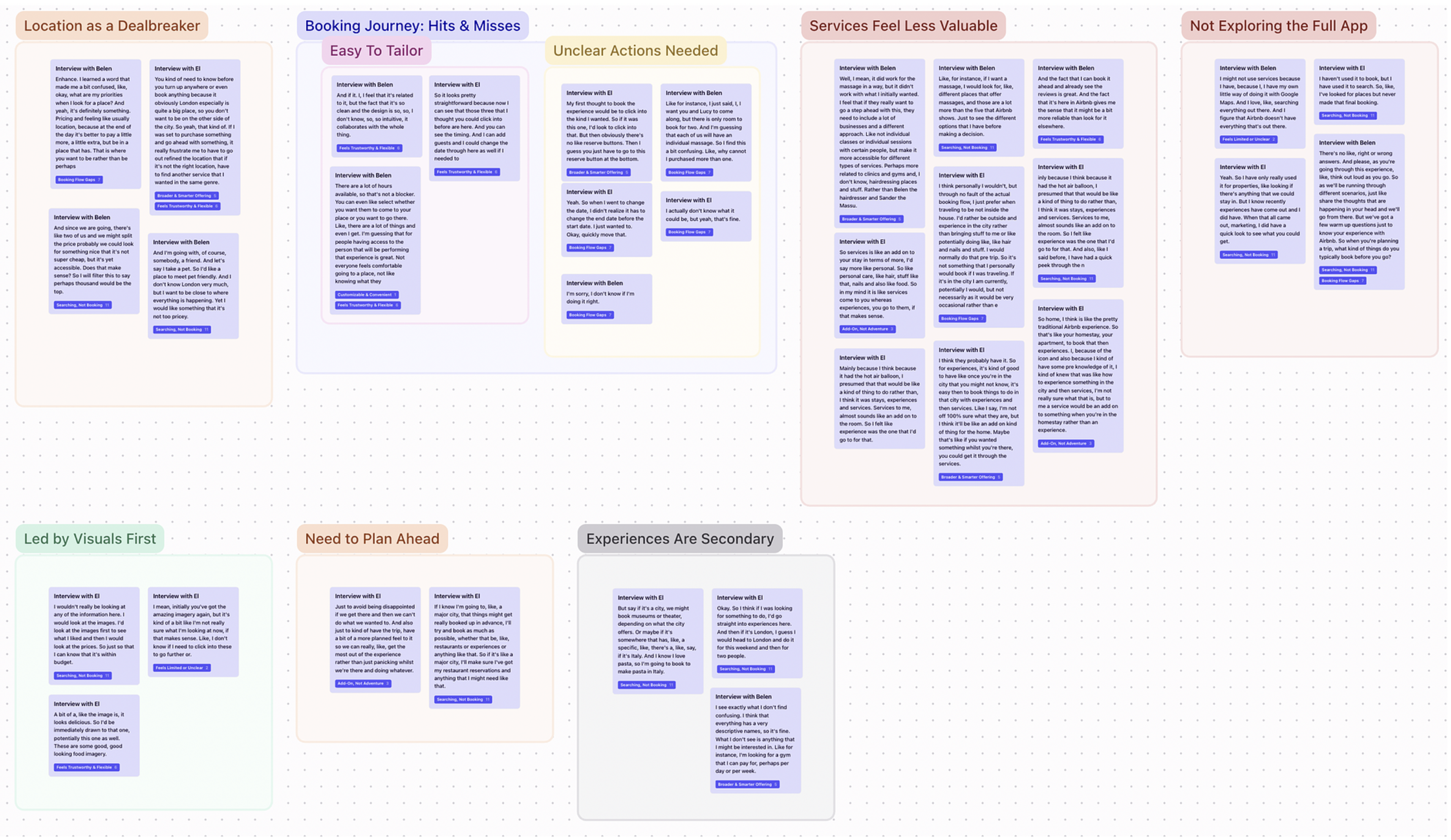
From the research and usability testing, several recurring friction themes emerged across the booking journey. I used these insights to identify the key areas of tension and focused on addressing them.
Concept Clarity Gaps
What's happening?
Users struggle to understand what Services are (vs. Experiences) and when each search control should be used.
"Is a cooking class under Experiences or Services?"
Information-Hierarchy Hiccups
Where is it?
Critical decision data is hidden below folds or requires hover actions that don't exist, forcing extra scrolling and slowing evaluation.
"I can't see where the chef classes are listed"
Transparency Issues
How much is it?
No timely feedback on how inputs affect price or feasibility, undermining confidence early on.
"My cart suddenly jumped to an insane number, I didn't even know where it came from."
Drawing up a hypothesis
Based on all this I was able to conclude a general hypothesis to where the pain points were rooted in.
Hypothesis
Overview
If we clarify what “Services” are, expose key package info above the fold, and show real-time pricing, then first-time users will reach the booking step with fewer back-tracks, because current confusion, hidden details, and surprise costs cause drop-offs.
Exploring directions
Keeping the hypothesis in mind I moved to FigJam and started ideating over the main clustered pain points I had discovered during my research.
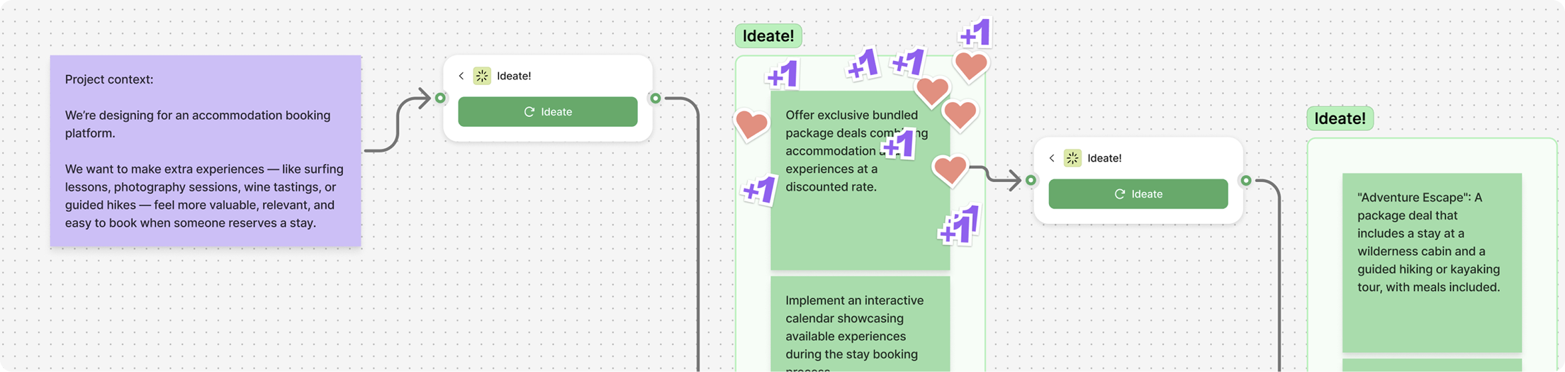
After discovering 3 main concepts from FigJam I went back to ChatGPT to root out the best out of the three, prioritizing them based on impact, urgency and alignment of our goals.
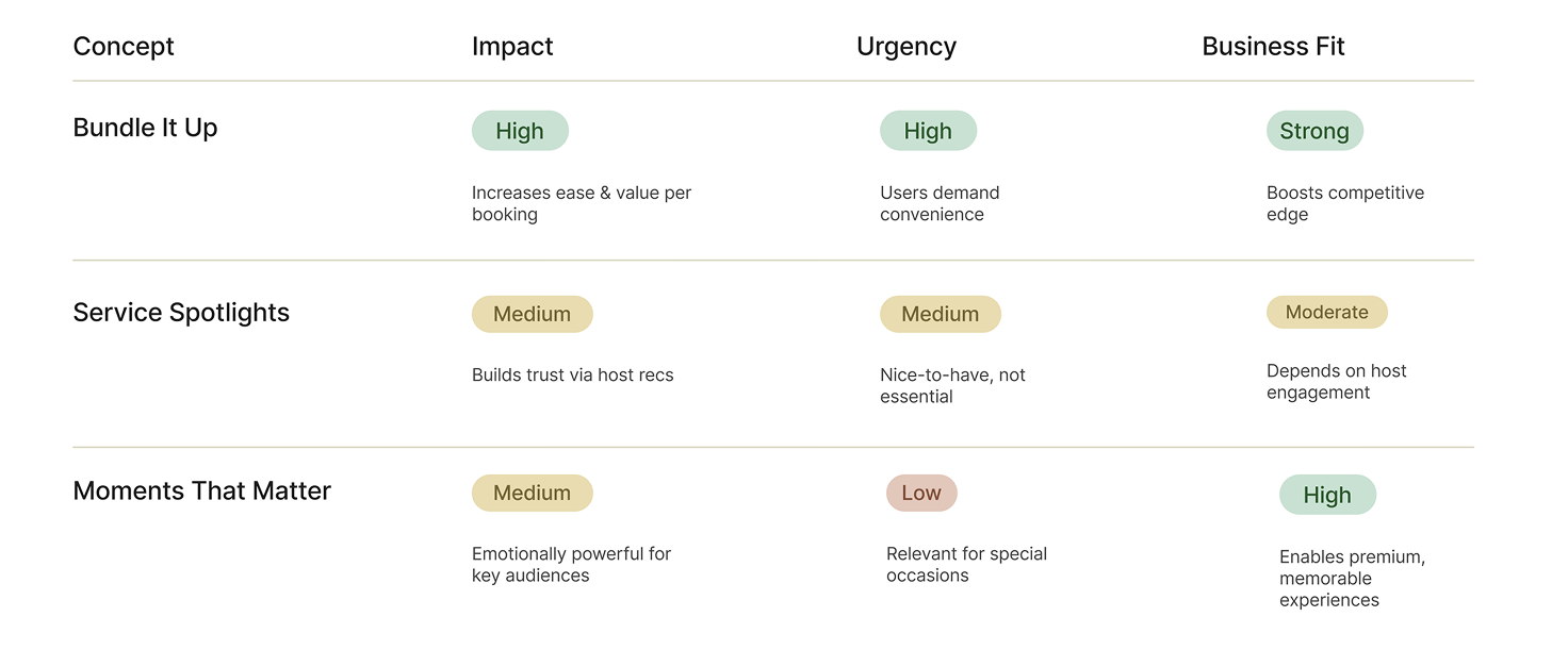
After taking into consideration all potential concepts to test, I ultimately focused on the “Bundle it up” option. It came out on top because it solves discoverability at the moment of decision - and grows existing booking revenue rather than competing with it.
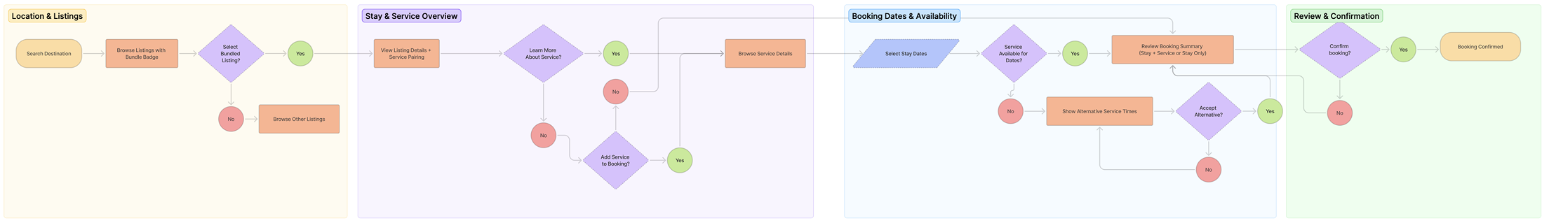
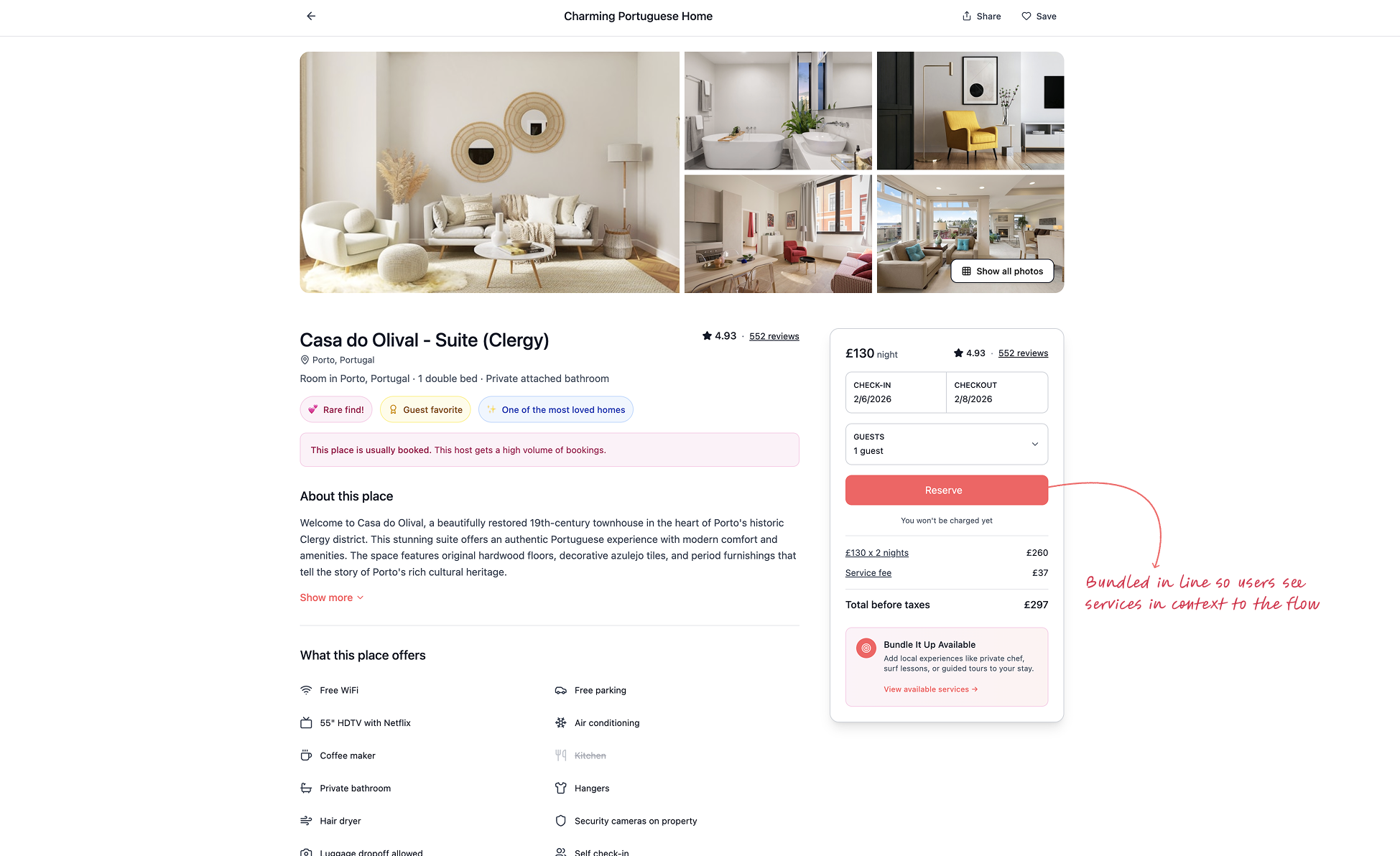
Bundle it up
This redesign ties Services back into the accommodation flow that already drives Airbnb. When a user books a stay, the top-rated services in that area surface inline - letting them add it and check out alongside their booking, rather than discovering Services in isolation.
Prototype developed with Figma Make
Growth Opportunities
What began as a personal frustration revealed something bigger. Airbnb's Services feature wasn't just a usability problem - it was a missed business opportunity. Bundling services into the stay flow rather than isolating them in a tab points toward a model where discoverability and revenue grow together.
What I'd still love to do: the biggest gap I'd close is validation. The friction research grounded my design choices, but the Bundle it up redesign itself is still untested. A small round of usability tests on the prototype would tell me whether the bundled flow actually reduces hesitation at booking - or surfaces friction I didn't predict.